My name is Jake Marsh.
I'm a developer, designer, and writer.

Subscribed via Push Notifications. You can also subscribe via RSS or Twitter.

Subscribe via RSS or Twitter.

Subscribe via Push Notifications, RSS or Twitter.

▸ Phantom Buttons on the iPad's Split Keyboard

Yet another example of details that 99.9% of users would never notice but use constantly.

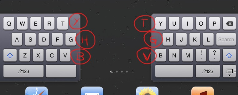
The iPad’s split keyboard has phantom buttons. If you’re used to typing Y with your left hand, you can.

To enable this keyboard, tap-hold on the “toggle keyboard” button in the lower right to get a menu, or tap-hold on it and drag upwards. Reverse that to reunite the two halves back to normal at the bottom.

Screenshot

I love discovering little tid bits like this. Apple (among others) manage to sprinkle them in the strangest and most obvious places.


▸ QuickLook Plugin for Mobile Provision Files

How many times has this happened to you?

  • I received the new mobileprovision file.
  • Great.
  • No.
  • What?
  • You still haven’t added my UDID in it.
  • I have.
  • No you have not.
  • Yes I have.
  • No you haven’t.
  • Yes.
  • No! Why don’t you just…
  • Look, I’m sure. Can you generate it again?
  • Ok, I will. Wait… ok, it’s done.
  • Let me check. No, sorry, still not ok.
  • Are you sure? [END OF CHAT CONVERSATION CENSORED]

MacMotion brings something to relieve the pain (slightly) of dealing with Apple Provisioning Profiles, and it uses one of my favorite OS X features, QuickLook.

After installing MacMotion's new QuickLook plugin Simply press the spacebar on any .mobileprovision file in the finder and instead of some boring 1 line summary, you'll get something like this:

Screenshot

It also has some great enhancements to Finder icons to quickly tell you if a profile is valid or not.

You can download the plugin here (at the bottom of the post).


▸ Parse JSON Directly into NSManagedObjects

Tom Harrington brings us another insanely valuable little bit of code that does some simple, yet awesome things with a parsed NSDictionary of JSON content:

  • Provide a safe, generic alternative to Cocoa’s -setValuesForKeysWithDictionary: for use with NSManagedObject and its subclasses
  • Handle cases where JSON data didn’t match up with what the managed objects expected. Getting a string where you expect a numeric value, or vice versa, for example, or getting a string representation of a date when you want a real NSDate object.

Basically Tom is examining his managed object's defined properties, and then looking into the NSDictionary he got when he parsed some JSON, and if any of the property key names exist in both structures, he sets the value.

The end result is being able to do something like this:

[myObj setValuesForKeysWithDictionary:jsonDict];

I love little tools and case studies like this as they always help to enlighten more of us to the awesomeness that is the Objective-C runtime.


▸ iPad Retina Images Found in iTunes U and iBooks 2 Files

This one is sort of a given these days, but appears we now have even stronger evidence that the almost-certainly forthcoming iPad 3 will have a Retina class screen.

Shown here is an iPad bookmark image resource with an @2x version:

iBooks 2 Retina Image Resource Screenshot

We have been finding references to 2X iPad images for well over a year (including iBooks 1.2), (...)

I'm posting about this as a nudge-nudge to my fellow iOS developers to keep this in mind if you are starting out on any new iPad projects, you'll need to whip up a new 2048×1536 resolution Photoshop document.

Should make designing iPad apps a little more interesting.


▸ Misconceptions About iOS Multitasking

Fantastic writeup from Fraser Speirs about iOS's multitasking capabilities and behavior. He goes into great detail about the ins and outs of things and covers all the different scenarios really well.

The problem is this:

If someone tells you that all the apps in the multitasking bar are running, using up memory or sucking power, they are wrong.

I too have heard the "advice" quite a bit recently that users should "clear out" their multitasking tray to "free up" memory and improve performance. This would be bad enough coming from "your buddy who read it on some forum", but apparently there are reports of Apple Genius Bar employees feeding this crap out to members of the unknowing public.

For the last time, (Fraser puts it perfectly):

The iOS multitasking bar does not contain "a list of all running apps". It contains "a list of recently used apps". The user never has to manage background tasks on iOS.

Most iOS developers know this stuff like the back of our hands, but it's important to remember that most of your users have no idea how any of this stuff is "supposed" to work.


▸ Zucchini: iOS Testing Written in Ruby & CoffeeScript

Zucchini is an awesome cucumber-like visual testing framework for iOS. It works in a pretty awesome way by compiling CoffeeScript down to UIAutomation-compliant Javascript, and then running the test with Instruments.app's command-line tool.

Also, As their site describes further, the whole system works very much like Cucumber, the popular ruby/rails testing gem:

A Zucchini feature file consists of sections bound to contexts of different application screens. Every screen you proceed to needs to be backed up by a CoffeeScript class describing all UI elements you want Zucchini to interact with as well as custom actions you feel like performing on that screen.

Here's an example of one such class:

class PostScreen extends Screen
  anchor: -> view.navigationBars()["Post"]

  constructor: ->
    super 'post'

    extend @elements,
    'Post': -> view.navigationBars()["Post"].buttons()["Post"]

    extend @actions,
    'Type "([^"]*)"$': (text) ->
      messageArea = view.elements()['Message Text Area']
      messageArea.setValue text

Zucchini has an impressive set of features including:

Zucchini only runs on Mac OS X 10.6 and 10.7 and requires XCode 4.2 as well as Ruby (at least 1.8.7).

The Zucchini site is full of really helpful links and installation instructions, so check it out, you can also find the Zucchini project on Github here.


▸ Creating the iOS 5 UITableView Bevel Effect

Oh man, I wish I had found Tim Oliver's writeup about this sooner (includes diagrams and sample code).

I just wrote all of this code myself, and had to do all of my own research. Serves me right for not properly Googling.

Pro Tip: Google everything before you begin coding a solution for a problem you assume everyone in your field must have.

You see, in iOS 5, Apple refreshed the look of a standard UITableViewStyleGrouped style UITableView. (You know, the ones with the rounded corners).

No longer were they actually white (like 255, 255, 255 or #FFFFFF). They were now a refreshing shade of 255, 255, 255, 0.8. That's still pure white, but with an opacity of 80%. Also, they added a 1 point tall drop shadow, as well as a 1 point tall inner shadow to each UITableViewCell. They've also still got a 1 point border around them.

I actually think the new cells looks much better, but they definitely break any custom code anyone had written to make their own custom UI or buttons match UIKit's.

I can't tell you how often I need to replicate this look and feel. Glad someone put together a comprehensive article about the topic.

Pro Tip #2: This is a pretty small detail, and sure, most people probably won't even notice. However, in my own anecdotal side-by-side tests, I was able to get an Oh this looks much better! reaction out of people by simply making my custom drawn stuff correctly match the system drawn bits.

▸ Connect, Discover, Edit, Inspect, Customize

A brilliant article by my buddy Ted Howard on the trials and tribulations of properly naming pieces of your user interface.

We needed a name for the button that brought up the stack editor. We wanted to convey to the user that launching the editor was a safe operation, that any changes they made would not be applied to the stack they were viewing. For that reason, we didn’t want to use ‘Edit’, because ‘Edit’ made it sound like you could modify something that someone else had made. We had many long conversations and debates about what to call the button. The thesaurus was consulted. Finally we chose a word: ‘Customize this stack’.

A good user interface can be killed by forgetting to think about these crucial details. Kudos to Ted for reminding us.


▸ Using Blocks for Drawing

I'm absolutely in love with the technique David Hamrick lays out in this post.

Instead of subclassing UIView every time we need to draw something what if we were to have one subclass that allowed us to pass in a block that performed the drawing code. So I’ve created a class called DrawView that does exactly that. It also passes itself and the graphics context since that was going to be needed in every block’s implementation so including them as parameters reduced the amount of boiler plate code needed.

It's a pretty simple idea: you shouldn't need to subclass just to do a tiny bit of custom drawing. Now you don't have to. With David's simple DrawView class, you can do your drawing like this:

DrawView *drawableView = [[[DrawView alloc] initWithFrame:CGRectMake(0.0 ,0.0, 320.0, 50.0)] autorelease];

drawableView.drawBlock = ^(UIView* v,CGContextRef context)
{
    CGPoint startPoint = CGPointMake(0,v.bounds.size.height-1);
    CGPoint endPoint = CGPointMake(v.bounds.size.width,v.bounds.size.height-1);

    CGContextSetStrokeColorWithColor(context, [UIColor grayColor].CGColor);
    CGContextSetLineWidth(context, 1.0);
    CGContextMoveToPoint(context, startPoint.x + 0.5, startPoint.y + 0.5);
    CGContextAddLineToPoint(context, endPoint.x + 0.5, endPoint.y + 0.5);
    CGContextStrokePath(context);
};

[self.view addSubview:drawableView];

I wouldn't be surprised to see something like this show up in a future update to UIKit. Apple is starting to use blocks everywhere. This is just good sense.


▸ Attaching a UIView to the UIScrollViewIndicator

Here's a neat little write up (sample code included) from Florian Mielke of how to replicate Path 2.0's neat behavior of "attaching" a timestamp indicator that follows iOS's built-in scroll indicator as you scroll.

The basic idea is to add the info panel’s root layer as a sublayer to the indicator’s root layer. With that, the info panel scrolls smoothly and stays in parallel to the indicator automatically. In the case were the scroll view hit the edges, we want the info panel to stay visible at the top or bottom of the screen, so we need to do some extra calculation to let it stay centered.

Screenshot

Love the technique, can't wait to see something like this start showing up in more apps. I think anything that intuitively allows developers and designers a way to remove ugly information like timestamps from rows of data is awesome.

Update: Here's a web-based implementation of the same effect.