My name is Jake Marsh.
I'm a developer, designer, and writer.

Subscribed via Push Notifications. You can also subscribe via RSS or Twitter.

Subscribe via RSS or Twitter.

Subscribe via Push Notifications, RSS or Twitter.

▸ Remote Debugging UIWebView

Hiedi Utley has completely brought the awesome with a way to use desktop Safari's WebKit inspector to debug iOS UIWebView objects:

Wow! What a day! While researching debugging techniques for an upcoming training class I am teaching on PhoneGap, I stumbled over a couple of blogs about a private API in iOS5 that will allow you to debug your UIWebViews right inside desktop Safari using the Web Inspector!

Enabling the trick requires part of a private API in iOS 5, so don't ship it. It does seem to work great though, and it's pretty simple:

- (BOOL)application:(UIApplication *)application didFinishLaunchingWithOptions:(NSDictionary *)launchOptions {
    // Uncomment to enable remote debugging
    [NSClassFromString(@"WebView") _enableRemoteInspector];

    return YES;
}

Then open up desktop Safari and head over to http://localhost:9999. It requires that you be running iOS 5 and running inside the iOS Simulator, but still, what a HUGE help.

(via Mike Rundle)

Update: Turns out Nathan de Vries did a lot of the original research and discovery on this one, here's his original (and in-depth) write up of it: Enabling Remote Debugging via Private APIs in Mobile Safari


▸ Android Graphics Truth Facts

Andrew Munn points out a simple truth about Android vs. iOS graphics rendering:

It’s because on iOS all UI rendering occurs in a dedicated UI thread with real-time priority.

He also clarifies:

  1. Compositing and previously set-up animations—all the stuff that involves the Core Animation rendering layer tree—do indeed happen on a background thread.

  2. Drawing new content into Core Animation layers and setting up their animations happens on the main thread. This is the same thread that user interface actions occur on.

  3. In naively written code, all developer-written code would occur on the main thread. However, Apple provides very easy APIs (Grand Central Dispatch and NSOperation) to move things into system-managed background threads. In iOS 5, you can even declare that a Core Data (object-relational database) context cannot be used directly on the main thread.

I love that we're finally starting to see some in-depth writing about the meat of these issues.

Pretty much everyone I speak to on a regular basis tells me "Android just feels laggy" or something of that nature. I can't speak to the specific causes of Android's hiccups in this department, but Andrew's post sounds pretty accurate to me in regards to Core Animation and UIKit rendering behavior.


▸ Gradient.app

A fantastic little OS X app here for configuring CSS gradients. The interface of Gradient is really fantastic and pretty close to perfect of this simple task.

Screenshot

You simply choose your color, and generate the CSS. It has all sorts of configuration options to support every modern browser.

Screenshot 2

Love little tools like this. It's $4.99 in the app store, grab it here.


▸ SNRFetchedResultsController

SNRFetchedResultsController is a "port" (not exactly) of NSFetchedResultsController from iOS to OS X. It is not a drop in replacement for NSFetchedResultsController, but performs many of the same tasks in relation to managing results from a Core Data fetch and notifying a delegate when objects are inserted, deleted, updated, or moved in order to update the UI.

As someone who is primarily an iOS guy, having this class around makes the thought of doing some larger Mac OS X and AppKit-based stuff much more inviting.

Implementing it is this easy:

NSFetchRequest *request = [[NSFetchRequest alloc] init];

request.entity = [NSEntityDescription entityForName:@"Car" inManagedObjectContext:context];
request.sortDescriptors = [NSArray arrayWithObjects:[NSSortDescriptor sortDescriptorWithKey:@"year" ascending:YES], nil];
request.predicate = [NSPredicate predicateWithFormat:@"wheels.@count != 0"];
request.fetchBatchSize = 20;

self.fetchedResultsController = [[SNRFetchedResultsController alloc] initWithManagedObjectContext:context fetchRequest:request];
self.fetchedResultsController.delegate = self;

NSError *error = nil;
[self.fetchedResultsController performFetch:&error];

if (error) {
    NSLog(@"Unresolved error: %@ %@", error, [error userInfo]);
}
- (NSInteger) numberOfRowsInTableView:(NSTableView *)aTableView
{
    return [self.fetchedResultsController count];
}
- (id) tableView:(NSTableView *)aTableView objectValueForTableColumn:(NSTableColumn *)aTableColumn row:(NSInteger)rowIndex
{
    return [self.fetchedResultsController objectAtIndex:rowIndex];
}
- (void) controller:(SNRFetchedResultsController *)controller didChangeObject:(id)anObject atIndex:(NSUInteger)index forChangeType:(SNRFetchedResultsChangeType)type newIndex:(NSUInteger)newIndex
{
    switch (type) {
        case SNRFetchedResultsChangeDelete:
            [self.tableView removeRowsAtIndexes:[NSIndexSet indexSetWithIndex:index] withAnimation:NSTableViewAnimationSlideLeft];
            break;
        case SNRFetchedResultsChangeInsert:
            [self.tableView insertRowsAtIndexes:[NSIndexSet indexSetWithIndex:newIndex] withAnimation:NSTableViewAnimationSlideDown];
            break;
        case SNRFetchedResultsChangeUpdate:
            [self.tableView reloadDataForRowIndexes:[NSIndexSet indexSetWithIndex:index] columnIndexes:[NSIndexSet indexSetWithIndex:0]];
            break;
        case SNRFetchedResultsChangeMove:
            [self.tableView removeRowsAtIndexes:[NSIndexSet indexSetWithIndex:index] withAnimation:NSTableViewAnimationSlideLeft];
            [self.tableView insertRowsAtIndexes:[NSIndexSet indexSetWithIndex:newIndex] withAnimation:NSTableViewAnimationSlideDown];
            break;
        default:
            break;
    }
}

SNRFetchedResultsController is created by Indragie Karunaratne. He has been rocking the Mac OS X open source stuff lately and this latest one doesn't disappoint.


▸ Compiling Doom 3 in Xcode 4

Fabien Sanglard brings us an extremely comprehensive guide to getting the recently open-sourced Doom 3 source code up and running on OS X using Xcode 4.

Love it:

Doom 3 Screenshot


▸ Scrapbook of an Advanced Core Animation View

Found this article that Drew McCormack put together while searching around for some CoreAnimation techniques this afternoon.

It basically covers the process of conceptualizing, imagining, wire framing, designing, implemented, performance tuning and testing a really awesome CoreAnimation interface.

Screenshot

These type of complete, comprehensive guides are quite rare in the Mac/iOS world and Drew really brings the awesome with it. I highly suggest you check it out.


▸ iOS Settings Shortcuts

iOS Settings Shortcuts

From the uber-talented Jeff Broderick comes this beautiful and awesome collection of iOS homescreen shortcuts to the major parts of iOS's settings app. Finally, you can have beautiful, quick ways to get to the parts of Settings.app you use the most.

Also make sure to check out Jeff on Dribbble, his work is awesome!


On Skeuomorphism

 •  5 minutes to read

iPad Calendar & Contacts

Skeuomorphism is a fantastic technique and I couldn't be happier with how it is used in the design of some applications. When used both properly and effectively, I believe it can lead to some of the best user interfaces the world has seen.

The "official" definition:

A skeuomorph or skeuomorphism is a derivative object that retains ornamental design cues to a structure that was necessary in the original.

In our world it's actually something a little more specific. I think my buddy Mike Rundle summed it up best in his post on Hacker News today:

There's a difference between "looking like something I'm familiar with" and "working like something I'm familiar with". The problem with bad skeuomorphic design is when it looks familiar but doesn't act like the thing it's mimicking.

I couldn't agree more.

I would take it a step further and say that the interactions of such an interface need to be intuitive and discoverable on the platform. Take this app:

Korg iELECTRIBE

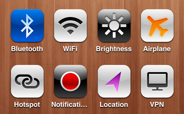
Yes, it does somewhat resemble a real world object. But, putting aside my own personal disdain for how hideous it looks, it has a major flaw: It is not usable. The minimum usable height for tap targets on iOS is 44 points. Take UIBarButtonItem for example, here's one:

UIBarButtonSystemItemAction

The good folks over at Korg completely ignore this fact. They have many buttons that are only 20 points tall. This not only makes the buttons hard to tap, but their placement makes the virtual "knobs" quite difficult to interact with. Also, given the large and clumsy nature of our pointing devices (otherwise known as "fingers"), turning virtual knobs is a very non-intuitive method of choosing a value from a range of values on a digital screen. A better way of handling this type of interaction could be something like the iOS movie player, which allows you to intuitively scrub through the timeline of the movie at high and slow speeds depending on the vertical position of your finger after beginning your action.

My point is that an app doesn't have to completely replicate the real-world interface to which it's referring. You merely have to remind the user with subtle but recognizable visual cues, then embrace the platform.

The Early Edition 2 for iPad does a pretty great job of this:

The Early Edition 2

The Early Edition 2 Sharing Screen

Their story-sharing screen is one of my favorites in any app, you really have to see the animations and interactions to truly appreciate it. They remind the user of a newspaper, even allow you to pull down the corner of the page and turn to the next, but they don't go too far. They don't make you un-fold the paper, shake to make the ads fall out, or (an unrelated rant) throw in full page ads in between the content you're trying to read. Their sharing screen is so elegant. It sort of mentally nudges you into understanding what's going on by emulating a manila envelope, even taping it closed for you.

Then we come to this little bastard:

Find My Friends

It resembles no actual recognizable interface or object (other than maybe a super shiny baseball glove or a native american friend-finding dreamcatcher). It is themed, at least it would seem, for the sake of being themed. At a glance, it doesn't necessarily look bad, it just doesn't make much sense. Apple has top-notch designers. I almost feel bad bringing Find My Friends up as it has been sort of hammered to death recently. However, I couldn't finish out this post without mentioning it.

If you aren't going to make a truly skeuomorphic interface, but are just going for a good looking app, then use textures and patterns with extreme care. Your users, and hyper critical bloggers like myself, will thank you.


▸ Slide Design for Developers

Great slides make for great presentations. But more than that, great slides really help people understand the information you're trying to present to them. Zach Holman outlines the finer points of this in a post on slide design targeted towards developers.

My slides are not designed for people who didn’t see the talk in person. They’re designed to support my words, not some online audience. What’s more, many commented that they found the design of the slides to be noteworthy. I’m expressly not a designer.

You really have to give Zach's post a read, there's a ton of great information in it, and to be honest, I'm loving the design of his slides, the typography really shines.


Linens 'n Things

 •  3 minutes to read

If you'll indulge me, I'd like to take a minute to talk about this little bastard:

Linen

In recent months, the conversation amongst many of my designer friends has often drifted to something like this:

What the hell is with all the crazy textures and patterns in Apple's user interfaces lately?

I personally don't really mind all the texture, it's usually used fairly tastefully, and doesn't bother me at all.

I gained some insight into Apple's use of texture by reading this post by Nevan Mrgan. Perhaps we can attribute everything, from the horizontal stripes of OS X's Aqua, or the vertical pinstripes of iOS's UITableView, to Steve.

However, ever since I first saw Notification Center, something didn't quite make sense to me. First, a couple of important user interface metaphors in iOS:

Notification Center

The metaphor of the main Notification Center panel is that it slides down over whatever content is currently on your device's screen.

Multitasking Tray

Here there's a similar interfacing layering metaphor going on. No matter what part of the OS you're in, double-tapping the home button causes whatever content is on your screen to slide up, revealing a "tray" containing icons of your most recently used applications.

Both of these interfaces have our friendly neighborhood linen as their background texture. On their own, this wouldn't be too much of an issue but consider what Apple's goals are with the linen texture. I would argue it is to establish a clear hierarchy of content and controls, from back to front. The linen was used early on as the "underneath" texture of UIScrollViews and UIWebViews.

Assuming these goals, take a look at what's really going on here:

Strange Z-Order

The linen texture now shows up at multiple points in the hierarchy. This completely destroys the illusion of seeing behind or underneath the layers of the user interface.

I'd love to see Apple remedy this and assign clear layers to the different pieces of the interface.

It could be as simple as revising Notification Center to have a simple black background with beveled section headers, similar to what the fantastic Nik Radjenovic mocked up and posted on Dribbble. Shown here:

MoreSensible Notification Center

Something like what Nik has mocked up would easily establish a top position for Notification Center, thus restoring balance and order to the force.

Apple designers: please let the reign of the dark lords of linen end soon.