My name is Jake Marsh.
I'm a developer, designer, and writer.

Subscribed via Push Notifications. You can also subscribe via RSS or Twitter.

Subscribe via RSS or Twitter.

Subscribe via Push Notifications, RSS or Twitter.

▸ CloudKit Quick Start

Apple:

This document gets you started creating a CloudKit app that stores structured app and user data in iCloud. Using CloudKit, instances of your app—launched by different users on different devices—have access to the records stored in the app’s database.

Really nice to see Apple going to such lengths to get developers using CloudKit. This is a fantastic read for CloudKit novices and experts alike.

Apple has been upping their documentation game lately. Not only with new developer library documents like this one, but they now even have a (semi) regularly updated Swift blog.

I am quite bullish on CloudKit. I find much of it's API to be pragmatic and intuitive. I'd like to use it for some ideas I've had, but I'm waiting to see which developer or app gives CloudKit it's first "Letterpress moment". Not just to see how it handles the load, but to see how the usage limits shake out.


▸ Github's Swift Style Guide

Github:

This is an attempt to encourage patterns that accomplish the following goals (in rough priority order):

  • Increased rigor, and decreased likelihood of programmer error
  • Increased clarity of intent
  • Reduced verbosity
  • Fewer debates about aesthetics

Some fantastic guidance in here.

One of my favorites is the bit about preferring Structs to Classes when writing Swift. This makes value types simpler, and can also be a bit easier on the eyes without all those extra inits hanging around.


▸ Apple No Longer Rejecting Calculator Widgets From The App Store

Sarah Perez at TechCrunch:

But now we’re hearing that Apple is changing its course. The PCalc app and widget will remain in the App Store, and all calculator-type widgets will be allowed as well, an Apple spokesperson has confirmed to us.

Well, that was fast. Glad to see Apple addressing this situation and responding so quickly.


▸ Apple Asks PCalc Developer to Remove iOS 8 Widget

Federico Viticci at MacStories:

Curious app rejections aren't new to the App Store, but being forced to remove a feature that was approved, featured by the App Store team, and appreciated by thousands of users is a different story.

I can't help but think this mess is a failure on Apple's part to better explain and campaign for the types of functionality they intended for third part developers to create in their iOS Today View widgets.

Apple dipped their toes in this a bit at WWDC, but didn't go far enough. There was an offhanded mention (or two) about "glance-able" information, but there was no real "selling" the concept.

In the past Apple hasn't been shy about explaining how you "should" use a particular API or developer feature. I sincerely wish Apple would have made a more obvious case for the types of things they were going to encourage (and allow) to be released as Today View widgets.

This situation has now made Apple's vision for Today View widgets crystal clear:

Apple wants third-party developers to help it deliver their answer to Google Now. Your Today View widgets should embrace similar look, feel, and purposes to the ones provided by iOS itself.

ETA comes to mind as a perfect example of this vision. Quick, glance-able and most of all, read-only. I get the impression Apple would prefer that the Today View be about consuming information, and not direct manipulation.

James Thomson is a wonderful developer with a long (no really, *long*) history of supporting Apple's platforms. It's unfortunate that he's being dragged through the mud on this one.

PCalc is available for iOS here and OS X right here, I highly recommend them.


How Can Apple Improve iOS 8 Adoption?

 •  9 minutes to read

Today Apple's App Store support page updated to reflect the latest iOS 8 adoption numbers:
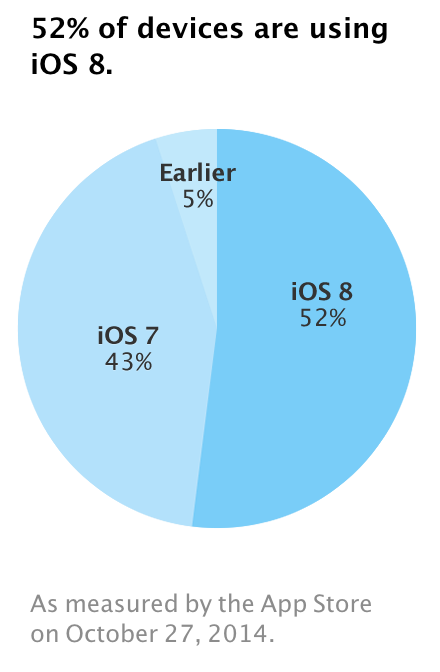
iOS 8 Adoption now at 52%

After 41 days in the wild, iOS 8 adoption has slowed a bit and is now sitting between 52-54%. As of today, Apple says 52%, and Mixpanel has it at about 54%. Last year, iOS 7 was at around 75% by this time.

This increases the complexity for app developers since we now have to support multiple iOS version for much longer than we needed to in the past. This means it makes business sense for us to make our customers happy and not release updates to our app that renders them unusable on their devices.

This has been a battle for just about every software platform in history, and historically Apple has had great success in getting users to update at sometimes shockingly fast rates.

This year, things are slowing. The cause of this shift has been discussed at length.

I'm convinced the slow down is being almost solely caused by the (now infamous) high disk-space requirements to install the update.

iOS 8 Update Storage Requirements

To make matters worse, Apple is still selling devices with 16 GB of storage. Once you subtract the amount needed to store the files needed to run iOS itself, the user is left with about 12-13 GB (depending on the device type) for their data.

This leaves many users in a position of having to pick the least-bad of two bad choices:

  1. Engaging in some kind of digital age "favorite child" process where they have to pour through their device and find things they are comfortable parting with
  2. Simply ignore the update and move on with their lives

Guess which one they usually choose.

So that begs the question: How can Apple improve this upon on this problem and allow?

Here's a few options, and some thoughts around each:

Apple could release smaller updates more frequently throughout the year.

As a company, Apple is often thinking not just ahead, but far ahead. This options seems unlikely as this would disrupt their entire software roadmap.

Apple could vastly increase their efforts to educate more users about upgrading through iTunes on the desktop

Upgrading to iOS 8 using iTunes on a Mac or PC doesn't have the same space requirements as "full" iOS update packages are downloaded and unpacked before being applied by iTunes itself, without using any unnecessary space on the device.

Many modern iOS users aren't even aware that their devices can be interacted with by plugging into their computer. They've been conditioned by things like iOS 5's "PC-less" setup improvements as well as the smooth installation processes of the past few years of iOS releases to understand that software updates happen on your phone. This would help some of Apple's more technically inclined users, but isn't going to fix the problem.

Apple could stop selling such low storage tiers to users who probably don't understand they're buying a fairly small capacity device

I'm fairly certain Apple does this for a few reasons. They'd like to push users to buy the mid-tier device, thus earning them another $100 in revenue. They'd also like to continue to provide three price-tiers (low, medium, and high) so they can hit all the different segments of their economic and retail markets. It makes great business sense, just stinks for consumers. I don't see storage capacities in the low-tier iOS devices increasing until possibly next year, but realistically 2 years or more.

These analog solutions are obvious, but I don't think that's best approach. The problem is digital. I feel the most effective solutions may be technical in nature, with the added benefit of being mostly transparent to the user.

Apple could split up their updates into smaller chunks, and installing them one at a time

If you've ever been using a piece of software (or any gaming console in the past decade) and used a feature to perform an automatic update of that software you've probably experienced the following madness:

ZBox 1080: You need to install an update before you can do the thing
ZBox 1080: Updating ZBox...
You: "Ah good it's going fast"
ZBox 1080: Downloading Update (57%)...
You: "Nice, it's already installing"
ZBox 1080: Installing Update (99%)...
You: "Sweet it's done, now I can do the thing, wait what?"
ZBox 1080: Updating ZBox...
You: "Wait, what are you doing?"
ZBox 1080: Downloading Update 2 of 35 (Estimated Time: 90 Million Hours)...
You: *defeated slouch*

This terrible infinite update syndrome usually occurs when a user is multiple releases behind and needs to download each one in succession and apply them one after another.

This evil, terrible power could be used for good though. One could imagine Apple adjusting their packaging process to create smaller "chunk" updates that get applied one after another. They could wrap the entire process under the shroud of a single progress bar. Each would be "unpacked" and "applied" one at a time, each one cleaning up after itself before moving on. The user would only need enough free to space to handle the unpacked size of the largest single chunk update.

This one would take a non-trivial amount of engineering work and depending how it's implemented, could increase the network load significantly on the update servers (if all the chunk updates were downloaded separately).

Allow the system apps to be updated individually

It might seem surprising 7+ years after iOS's introduction, and 6+ years after the introduction of the App Store, that Apple still updates all of their system-level apps through one big single update. We iOS users update millions of apps a day through the App Store, why not use the same system to push out updates to the system apps?

This turns out not to be as straightforward or simple as you might hope. Many iOS system applications have deep ties into other parts of the system. Something as simple as the Notes app has be able to read the list of your configured Mail accounts, as well as sync to them if you choose.

I can imagine a siracusa-esque time-scale long-term plan here where Apple moved towards a modularized system like this. It does feel more like a "wouldn't it be great if someday we could..." idea.

Of course, all the countless private system-level APIs an data storage mechanisms Apple uses in their system apps would pose a bit of an issue when interacting with the App Store system. Apple might not exactly have to worry about getting rejected for using private APIs like the rest of us, but I doubt they'd just throw their apps on the App Store and call it a day.

It's much more likely that Apple would work towards introducing many more extension points and try to open up even more system-level APIs and get them ready for primetime.

There's plenty more factors Apple has to balance when trying to solve this problem. Network load, install time, not to mention all the new potential points of failure any changes here would introduce.

It's a complex problem, but one that I'm sure Apple is astutely aware of.


▸ "Multichannel Video Programming Distributors"

Nilay Patel at The Verge:

This is a wonky legal tweak — Wheeler just wants to expand the definition of "multichannel video programming distributor" so that it's not specifically tied to cable and satellite companies — but it will have huge effects. Allowing tech companies to properly compete against the entrenched interests of cable companies will rapidly improve the quality of our TV experience: we'll see better integration with our other devices, new interface ideas that actually work, and we'll finally finally be able to ditch our gigantic crappy cable boxes.

I can't help but think we're getting closer and closer to the dream.


Holding it Wrong: A Landscape Lock Screen

 •  9 minutes to read

I've been a proud owner of the new iPhone 6 Plus for over month now.

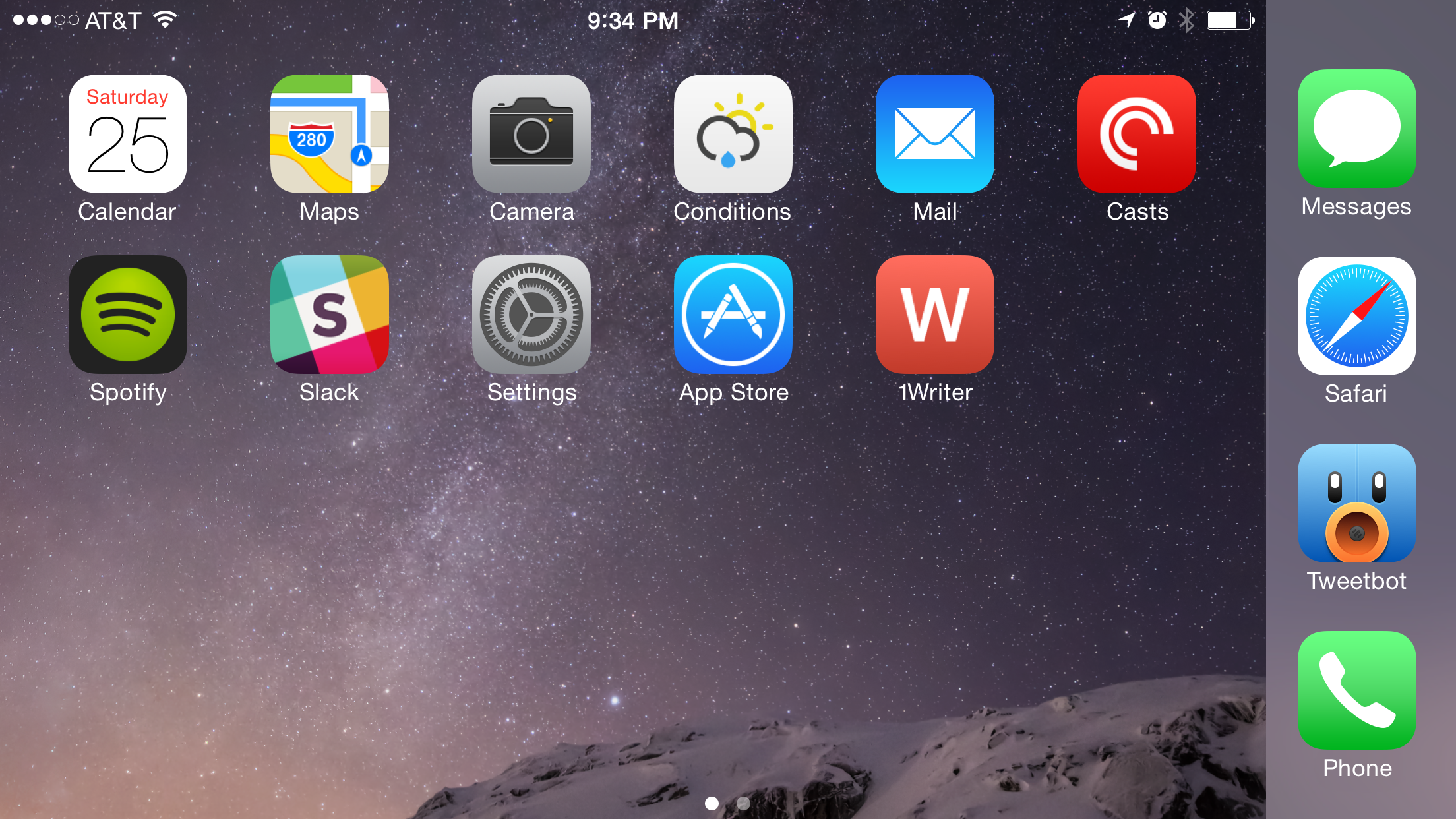
I love it. It's easily my favorite device I've ever owned. 1 One of my favorite parts about the 6 Plus is the improved landscape support. Apple has even enabled landscape support for Springboard (the home screen) on the iPhone for the first time:

Landscape Home Screen

Interestingly, this is the only (that I know of) screen in iOS where the right-side elements of the status bar do not appear in the far right corner of the screen. The 'dock' pushes them over slightly. This makes sense, as there are obvious readability issues with displaying the white status bar over the light-background dock. Also, if you were to be in a state where you had many status bar items displayed, it could appear visually very noisy for some of the items to be displayed over your wallpaper, and some over the light-gray (blurred) background of the dock.

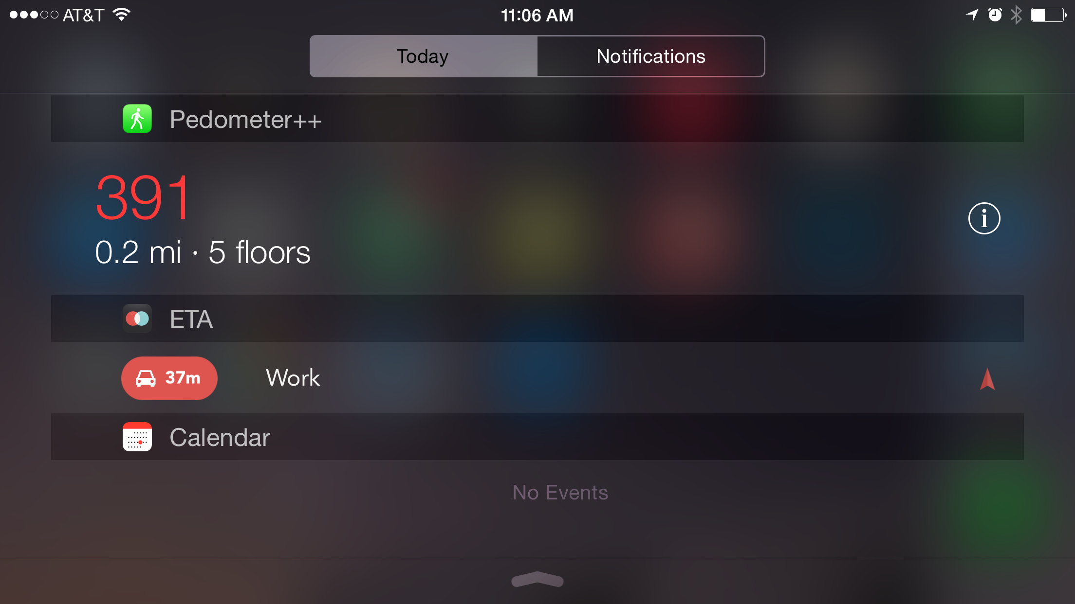
Pulling down notification center is an arguably more common practice with iOS 8's new Today view widgets functionality. Thankfully, Apple has also added support for landscape orientation here as well.

Landscape Today View

Please ignore the embarrassingly low step count for this morning.

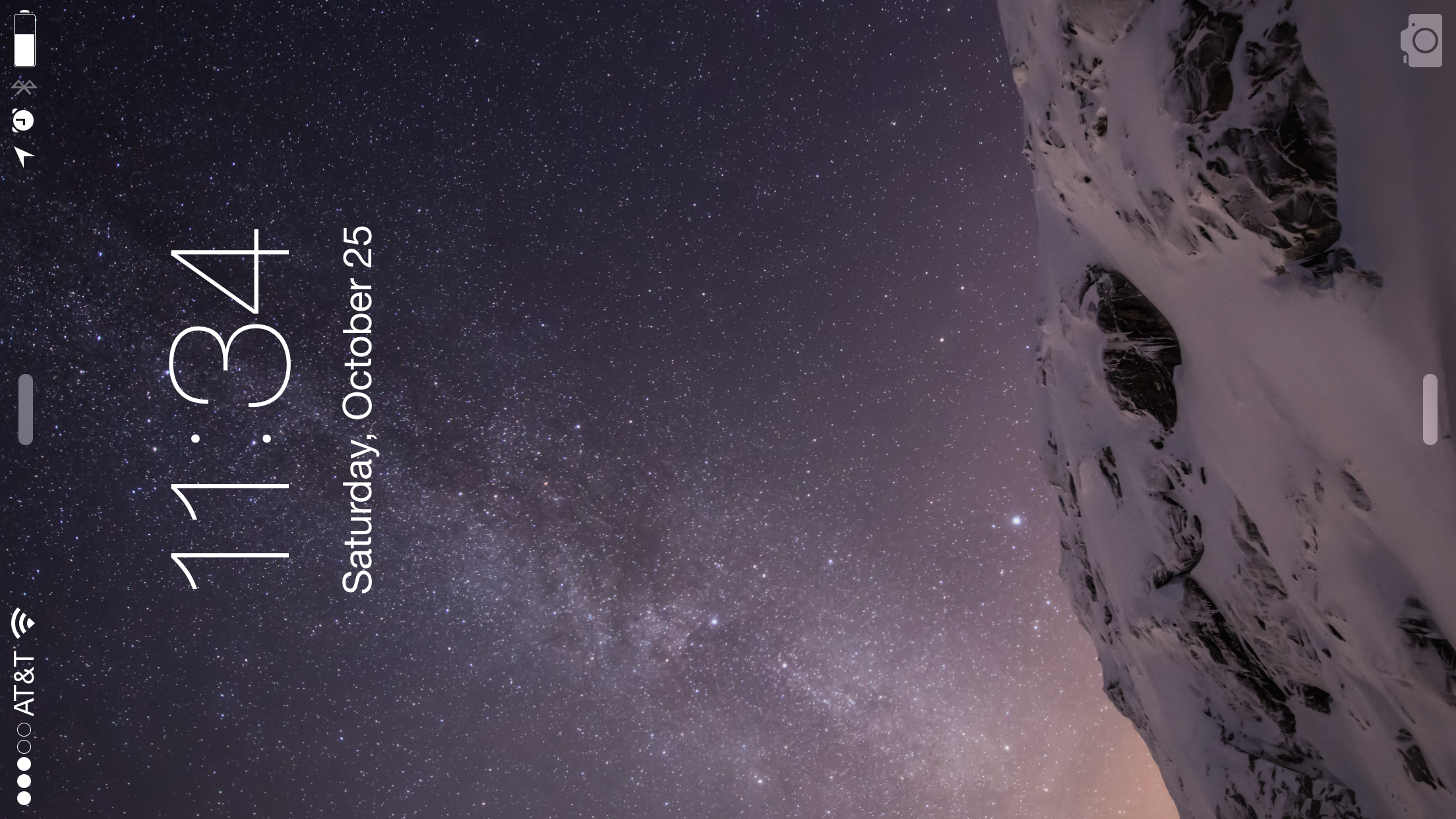
Where things begin to break down is when you're holding the device in landscape, and you're in an app that has added landscape support. You finish your tasks and press the home button. You're then shown the home screen, again in landscape, like the screenshot above. So far so good. If you then press the lock button (or the 'sleep/wake' button as Apple likes to call it), you're suddenly looking at everything (at this point most likely just the time and date) sitting there on it's side.

Portrait Lock Screen on It's Side

With all of the recent improvements to landscape support, I find it curious that the lock screen wasn't included in the upgrades.

The obvious (and most likely) reason may simply be that time constraints forced Apple to push this particular feature down on the road map a little. Totally understandable, and I hope that's it.

On the other hand, I could see an argument that users don't usually interact with the lock screen for long periods of time, and it's purpose is to provide glance-able information, not a full-fledge user interface. This isn't an unreasonable position, but there could be many upsides to supporting it, and I believe it could be done without degrading the overall user experience.

My phone is usually in landscape orientation on my desk (I often listen to podcasts this way while working), and it also rests in this position in my car. In these and many other situations, if a notification or a phone call comes in, I'd love to be able to glance at it, quickly evaluate it's importance and either act on it or return to whatever I was doing.

As things stand now, this type of interaction isn't really achievable. Today one of a few things happens:

All of these are less than ideal, and could be easily addressed with even the most rudimentary landscape support on the lock screen.

The iPad has had landscape support for it's home and lock screens since it's original launch, so it wouldn't be unprecedented. The iPhone form factor (and it's wide-screen aspect ratio) would demand a few special considerations.

While writing this post, I found it a fun exercise to think about what such a feature might look like.

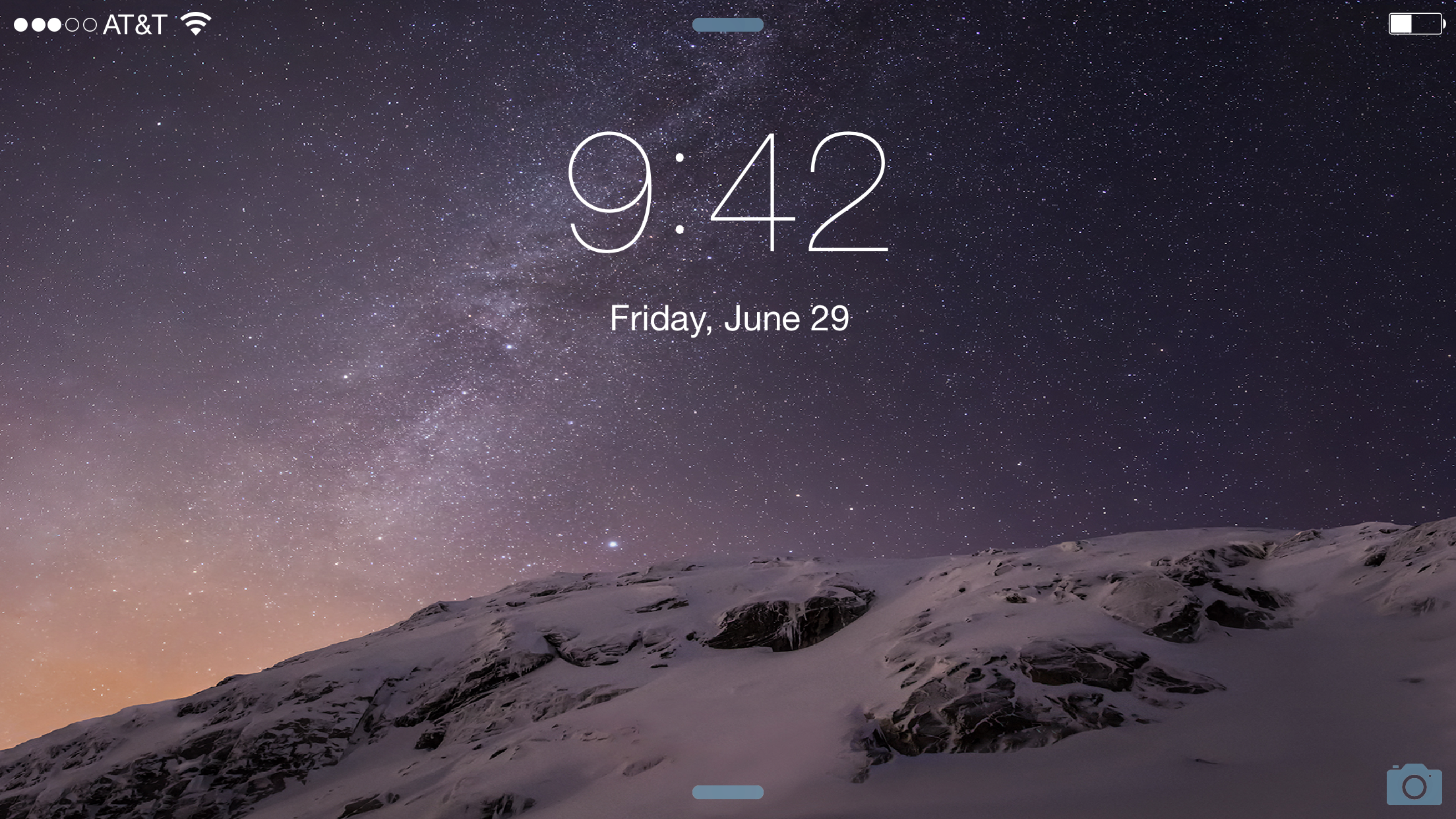
Here are my results:

Landscape Lock Screen

As you can see it's a fairly predictable design. The time is simply centered and positioned in a similar way to it's portrait-oriented siblings.

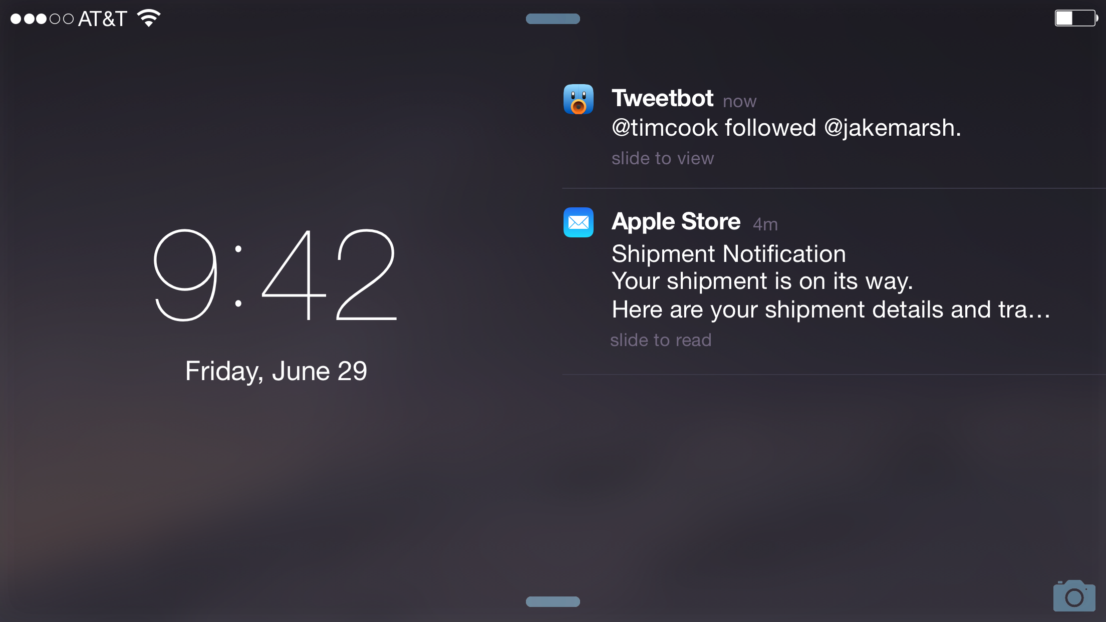
Where things begin to get interesting is when notifications are displayed. Here we can see a couple of notifications have been delivered. When this happens the time could slide out of place to create a sort of side-by-side layout.

Landscape Lock Screen With Notifications

All the slide-to-action interactions are still present and work as expected. Also, since the Camera app already does a great job of supporting landscape orientation, the slide-to-open straight to Camera interaction still works great. Any Handoff or app-suggestion interactions (where an app icon appears on the bottom-left corner the lock screen, and allows you to slide up to open it) also work as expected.

The iOS lock screen may appear simple and almost featureless at first glance, but it actually serves quite a few different functions, and adding landscape support for all of them is certainly a non-trivial task. Again, it strikes me this is likely the reason for not supporting this yet, given the almost certainly enormous complexity of this part of iOS's codebase.

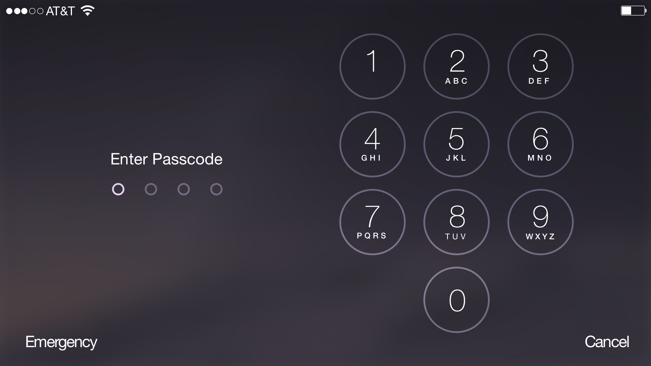
One of the many features the lock screen must provide is the ability to enter your device's passcode (should you choose not to, or be unable to use Touch ID to unlock your device). Here's one way this could be implemented:

Landscape Lock Screen While Entering Passcode

As you can see, we again take a side-by-side approach given the user very large circular buttons with very large tap areas, perfect for quickly tapping out the 4 digits while likely trying to quickly unlock their device.

Lastly, I wanted to explore what it might be like to receive a phone call with your device in landscape.

These days many of us aren't holding our phones up to our ears to speak (if we're even still making phone calls at all that is). It's becoming increasingly common for someone to be performing a task on their device while wearing earbuds with a built in microphone, and then to receive a phone call.

Ideally the user wouldn't need to rotate their phone (or their head) to react to the incoming call. They could respond how they wish (answer, decline, send a text, or set a reminder) and then continue on with their original task.

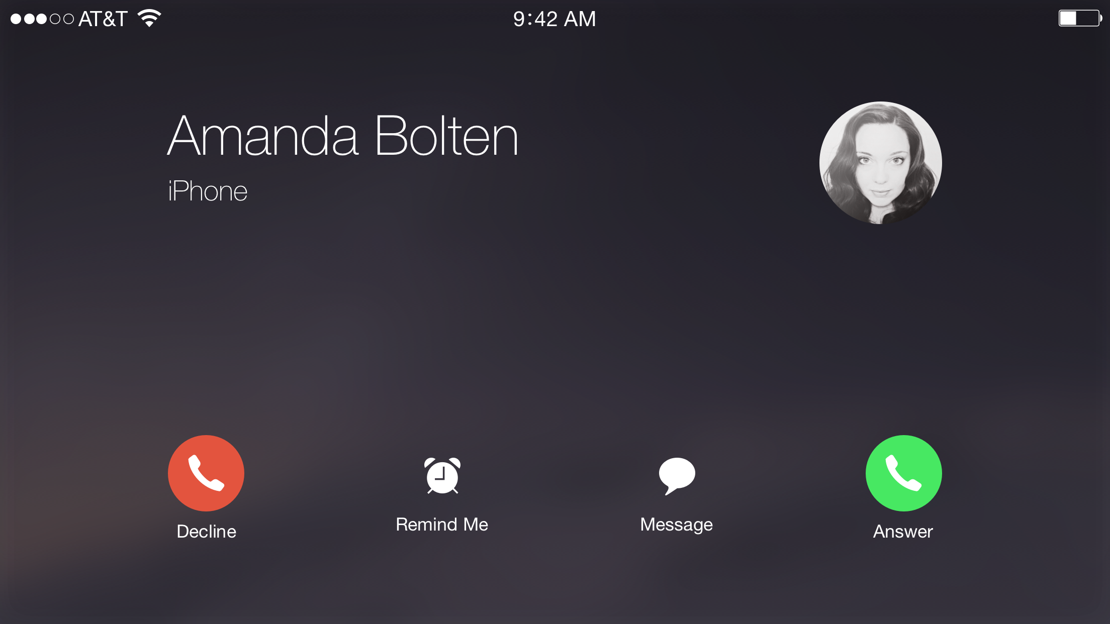
Here's what it might look like:

Landscape Lock Screen With an Incoming Phone Call

Here we go with a more "traditional" landscape interface implementation. The various elements are allowed a bit more room to breathe, and the most important elements (the name and photo of the person calling) are enlarged for easier viewing.

I had fun exploring what a landscape lock screen might be like. These improvements represent a few sensible ways to support landscape on the lock screen without needing to introduce any radical new interface conventions.

If you'd like to experiment or play around with any of these ideas, you can download the Sketch source file for these mockups and do whatever you'd like with it. It is available right here.


  1. My Retina Macbook Pro is a very close second. 


▸ CVS Disables Apple Pay

 •  4 minutes to read

We've been driving towards a contact-less payment system for decades. Almost everyone in our industry has taken a run at it and most all have come up short, until now.

CVS (and Rite Aid and I'm sure many others to come) fighting Apple Pay as a threat is an incredible amount of validation after only a few days of Apple Pay being available. Put simply: Apple Pay is taking off.

The reason behind Rite Aid's and CVS's moves to disable unofficial Apple Pay support in their stores is presumably related to their participation in Merchant Customer Exchange (MCX), a retailer group developing its own mobile payments system known as CurrentC.

As for the strategy: I fail to see the wisdom in a business strategy of doing what your customers do not want.

Here's a few examples of people reacting to these developments:

Things gets even worse when you look closer at the details of CurrentC itself:

Just so we're clear: The corporations participating in MCX aren't doing it for money (at least not directly). They are not upset about having to give Apple a 'cut' of their profits. The Apple Pay contracts are set up so that the retailers aren't losing a penny more than they would on standard card transactions. These companies want to track your buying habits and use that information to better target their marketing efforts towards you.

And yes, that is one valid way for a business to increase it's profits. It has been wildly successful for decades of modern consumerism. But things are changing.

Another approach is to provide a service, product, or experience that is so compelling that it alone draws customers in and convinces them to spend their money with your company. Apple has used this technique (among countless others) splendidly over the last 15 years.

These days technology is advancing much faster than marketing executives are changing their tactics. Apple Pay is yet another technology product that is doing the dirty work of dragging parts of the business world into the future.

So far Apple is simply doing what they do best with Apple Pay: delivering customers a fantastic experience and taking measures to satisfy people's possible concerns about the change to a new technology. (In this case security and privacy).

I say 'so far' because I can't help but wonder what a more aggressive Apple might do:

I guess we'll see.


Apple Fall 2014 Event Predictions

The hype is at an all time high the night before this event. This is a quick post to round up and list off what I'm expecting to see tomorrow morning.

iPhone 6

iPhone 6+

Wearable (iBand/iWatch)

iOS 8

A ship date will be announced (likely September 17th, next Wednesday).

Payments

All devices discussed will include NFC chips to enable simple, "cardless" payments. These will use "tokenized" payments (where the actual card number isn't transmitted wireless, but rather a one-time-use "token" is sent instead), as well as the Touch ID sensor. This will enable Apple to tout it's approach as being more secure than previous attempts by competitors. A line up launch partners (retailers, brands, etc.) will be announced.

More

We'll likely see a deep dive look into the Payments and Health offerings of all the devices. A good amount of time will be devoted to the larger screens and how Apple has made using such devices with a single hand more enjoyable.

I expect we'll also see a re-cap of iOS 8 and OS X Yosemite with special emphasis on features like Continuity and Handoff.

A large portion of the presentation will likely focus on Apple's shift into a "lifestyle" company: how it is making devices and services that solve "real" problems and "fit" well into everyone's lives.


Cover tmnt 2014

Teenage Mutant Ninja Turtles (2014)

 •  18 minutes to read

I watched Teenage Mutant Ninja Turtles (the movie that was released in 2014). I have some thoughts about it, here they are.

Read Post